#Dyslexie Font: Aid for #Dyslexia
#Dyslexie Font: Aid for #Dyslexia

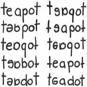
Photo Credit: “Dyslexic words” by The people at positivedyslexia.com. – http://www.positivedyslexia.com/images/teapot_words.jpg. Licensed under Creative Commons Zero, Public Domain Dedication via Wikimedia Commons – http://commons.wikimedia.org/wiki/File:Dyslexic_words.jpg#mediaviewer/File:Dyslexic_words.jpg
If you have Dyslexia, you know how difficult it can be to function in daily life. Did you know that about 10% of the world population is believed to be dyslexic?
Dyslexia has nothing to do with intelligence. Some have more severe forms than others so they struggle more. I find it surprising that more innovation has not been done before now given the numbers of people who have this diagnosis.
Reading Aid
Christian Boer, a Dutch designer who is dyslexic himself, set about designing a typeface that would aid in reading tasks. Per the Time.com article:
“When they’re reading, people with dyslexia often unconsciously switch, rotate and mirror letters in their minds,” Christian Boer, the designer of the typeface Dyslexie, told Dezeen magazine in an interview published Sunday. “Traditional typefaces make this worse because they base some letter designs on others, inadvertently creating ‘twin letters’ for people with dyslexia.”
A typeface such as Helvetica, for example, uses an upside down “n” as a “u” and a backwards “d” as a “b.” But Boer, who is dyslexic himself, created bottom-heavy letters to keep readers’ brains from turning them. The spaces between letters are bigger, and punctuation marks and capitalized letters are also bolder to better distinguish the beginnings and ends of sentences.
For those of us who are not dyslexic this information helps us to better understand the challenges that those who do have it are faced with everyday. This article on cbsnews.com and this one on abcnews include graphics that illustrate what this font looks like and why.
You can go directly to dyslexiefont.com and download the Home Use version for free. They also have a short little video illustrating how and why the font is designed the way it is.
The subject of dyslexia is huge. There is no way to address it and do it any justice in a single post like this. However, by bringing attention to this new font perhaps it will shine a new light on it. Perhaps more will take up the challenge to develop more aids like this font.
Do you know someone with dyslexia? What aids do they use to help them cope?
Until next time…
Geek Grandma
Filed in: Children and Reading • Interesting Facts • reading


What a fantastic idea to use a different font. I'm surprised that the computer software developers haven't come up with something like this before as accessible computer stuff has been in the works for a long time such as voice activated software. I guess they figure spell check is all they have to do.
I'm with you. I am surprised it has taken this long.
The Kobo (at least the one I have) has this font, I used it for a bit but I prefer a more traditional font. It was very interesting to just read and “feel” my way around the font.
Also, it’s cool that it comes from the Netherlands! I’m Dutch myself so it’s cool to know that people in my own country are working on it. (which might also be the reason my Kobo has this font pre-installed)
If you don't have the reading issue, I can see where you would prefer regular text. It is cool that the creator is from the Netherlands.
What a very cool idea! I'd never given any though to fonts using an upside down 'n' for 'u' and how bottom heavy letters could make such a huge difference to a dyslexic. You are right…it's a very big topic that affects millions of people. Nice to see that technology can offer some aids.
Until I read the explanations I did not understand. Who knew such simple things were such a big problem?
Thanks for sharing this, Cheryl. What a wonderful tool for someone with dyslexia!
Great post! I have math dyslexia and it's very frustrating. I can't be trusted to write down a phone number correctly.
It must be very frustrating. I am glad they are now developing tools to help.
I came across some info about fonts for dyslexics and forwarded the link to Susan, but it was long enough ago, that I don't remember if it was this specific one or something different.
Susan has lots of friends and tools to help her succeed. 🙂
Do I know someone with dyslexia? Yep, Me! Thanks for bringing attention to this, Cheryl. This is very interesting and I plan on downloading the font right away and see if it helps. It sure makes sense when you realize they are just flipping the letters and using them as other letters why it would make things even more difficult for those of use that are dyslexic. As for me I use editors, proof readers and software packages to help with writing my posts and my books. It is definitely a challenge. 🙂
Although conceptually I understand the issue, until I saw the illustrations and read about it I could only imagine. Reading about this new font has helped me actually get my brain around the struggles you must have.
Great idea, Cheryl. There are so many dyslexic people in the world. For some reason you find an abundance of European aristocrats with dyslexia. The future queen of Sweden has it.